

Landing pages are not just there to look good or capture leads.
Their real job is simpler and harder at the same time.
They help people decide.
Most people who land on a page are already interested. They have searched, been referred, or clicked for a reason. What they need now is reassurance, clarity, and momentum. Not more noise.
A good landing page removes doubt. A bad one creates hesitation.
Let’s break down how landing pages actually support buying decisions and why small details matter more than clever copy.
Decision making happens fast
When someone lands on a page, their brain immediately asks a few silent questions:
- Am I in the right place
- Is this for someone like me
- Do I trust this business
- What happens next
This all happens in seconds.
Your landing page either answers those questions clearly or forces the visitor to work it out themselves. When people have to think too hard, they pause. When they pause, they leave.
Landing pages reduce decision friction
Buying is rarely about convincing. It is about removing friction.
Friction looks like:
- Unclear headlines
- Too many options
- Vague benefits
- Missing context
- No explanation of the process
- Weak or confusing calls to action
Every unanswered question adds weight to the decision. A strong landing page lightens that load by guiding people step by step.
The role of each section on a landing page
A landing page is not one block of content. It is a sequence of decision checkpoints.
Above the fold
This is the orientation moment.
People want instant clarity on:
- What you do
- Who it is for
- The outcome they can expect
If they cannot work this out quickly, they will not scroll.
The problem and the context
This is where people feel seen.
They want to know you understand:
- Their situation
- Their frustrations
- Their goals
This builds emotional alignment. People buy when they feel understood.
The solution
Now you explain how you help.
Not with features. With outcomes.
What changes when they work with you.
What feels easier.
What improves.
This is reassurance, not selling.
Proof and trust
Before deciding, people look for signals:
- Testimonials
- Case studies
- Reviews
- Real names and faces
- Experience and credibility
This is where trust locks in.
Process and expectations
Uncertainty kills decisions.
Clear steps remove fear:
- What happens after they enquire
- How long things take
- What they need to do next
Clarity here is powerful.
Call to action
A call to action should feel like a natural next step, not a leap of faith.
Good CTAs are:
- Specific
- Calm
- Clear about what happens next
Book a call feels safer than Contact us.
Get a quote feels clearer than Enquire now.
Landing pages support return visits
Most people do not decide on their first visit.
They come back.
On return visits, they look deeper:
- About pages
- FAQs
- Process sections
- Pricing explanations
Your landing page needs to hold up every time they return. That is why consistency and structure matter more than trends.
The decision support loop
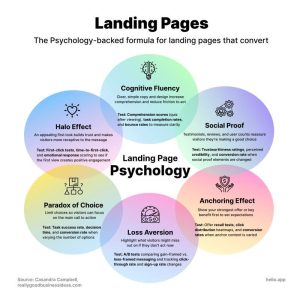
Here is a simple way to visualise what your landing page is doing.
Attention
↓
Clarity
↓
Relevance
↓
Trust
↓
Confidence
↓
Action
A strong landing page supports each step. A weak one breaks the chain.
Why this matters in 2026
Search has changed. AI has changed. Behaviour has changed.
But human decision-making has not.
People still want:
- To feel confident
- To avoid risk
- To understand what happens next
Landing pages that support decisions outperform pages that just look nice. Always.
If people are landing on your page but not taking action, the issue is rarely traffic.
It is usually hesitation.
Your landing page should feel like someone guiding them calmly forward, not pushing them to decide faster.
If you want help reviewing your landing pages through a decision-making lens and spotting where friction is creeping in, that is exactly what we can help you with.
Book your Website Review and start with confidence.